Say something...
Nothing found. Please repeat.
Unsupported browser. Sorry...

The Most Exciting Design Trends for Home Page of E-Commerce Websites for 2021 & 2022
Responsive Banners
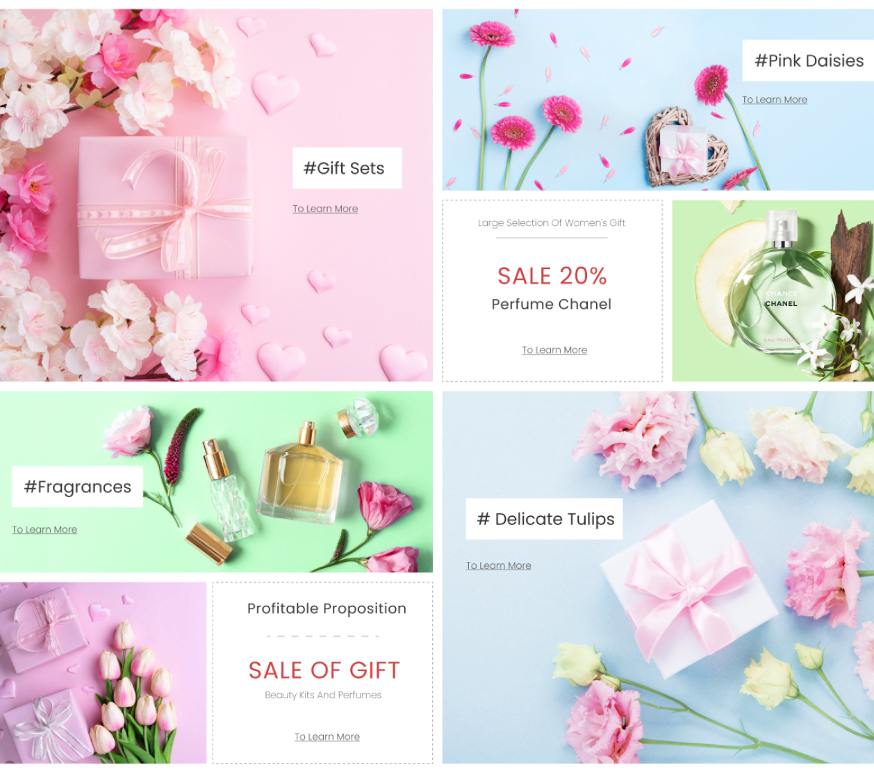
A customizable and responsive information block with attractive banners, designed to provide useful information to convince customers that your store is trustworthy and highly rated among others.
There should be "air" on the banner, and the more there is, the better. The percentage of the area occupied by text and graphics should be the same regardless of the size of the advertising surface. At least 60-70% of the banner should be occupied simply by an unobtrusive, or better, a solid background.

Harmony is important in everything. The human eye intuitively separates the stylish from the ugly, even when your client does not have a developed sense of beauty. Do not forget about equal margins from the edge, about uniform lines along which the text is aligned. As an example Bikini Island - Fashion SexShop Clothes Prestashop Theme
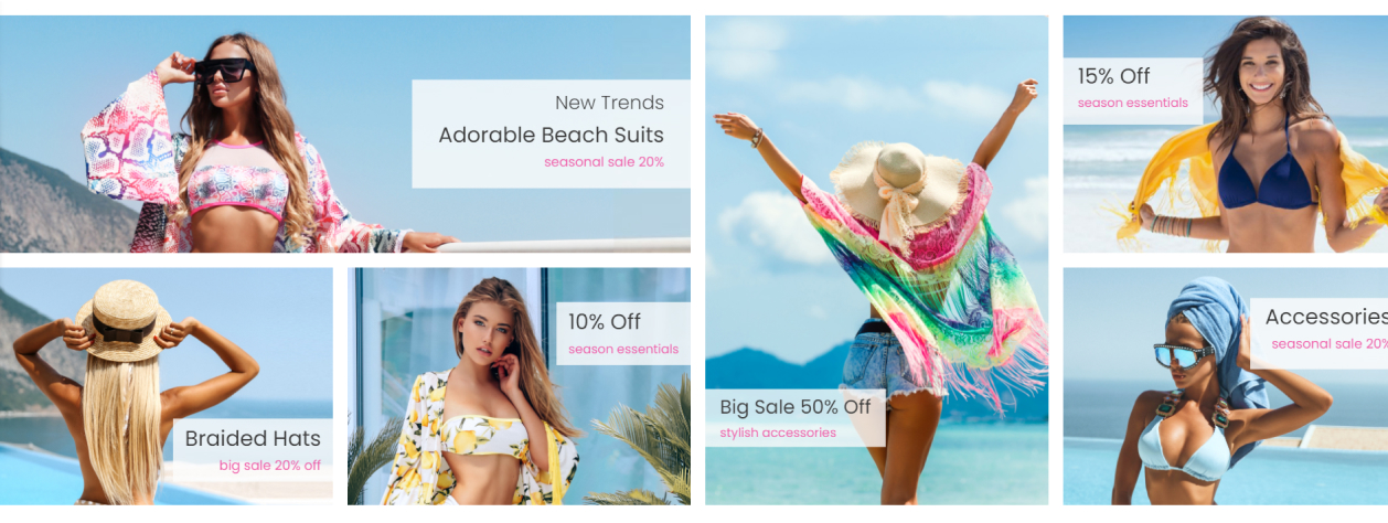
Colors evoke different associations, so choose them based on the kind of emotion you want to evoke in your users. In the Clean Heandy - Art & Handmade, Crafts Prestashop Theme, pay attention to the color, because this is the first thing that users will react to when they see the banner. Also, pay attention to how to arrange your banners so that they are harmoniously combined.
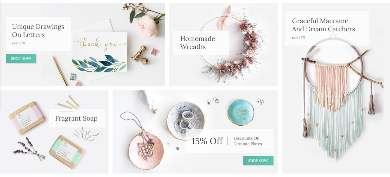
A second is enough for a person to evaluate a banner. In flat website designs, flashy banners look out of place and annoying. Avoid flashy banners with a wide color palette in favor of simplicity and conciseness. Use simple banners with an emphasis on content. The more content you have, the more likely you will confuse and scare users away. Don't be dazzled by animation, a rainbow of colors, and information. You will love banner ads in Monaco Fashion – Clothes & Shoes Prestashop Theme
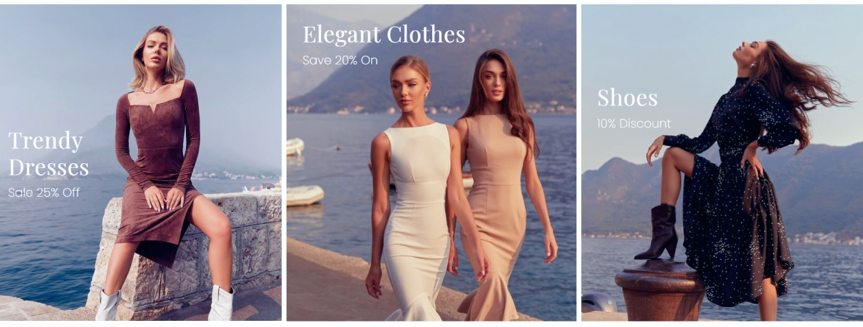
Generally speaking about images on banners, images are not always necessary. Strong copy and good typography work just as well, as shown in the example below.
The quality of a banner is not in the way it looks, but in the clicks it brings. It may be the most perfect in terms of design. But, if it brings clicks, you are doing everything right.
Header Design for Different Themes
The site header design has a wide field for creative solutions. This is where the key navigation elements are located. The screenshot shows the home page of an online comic store: at the top of the site header, you'll find the logo, main menu, and cart, setting, profile, compare, wishlist and search icons. As an example Nastya Fashion - Clothes, Shoes & Bags Theme

On the template Fastest Drift - Auto Parts & Car Engines the version of the site header with a signature under the navigator icons. The main menu with a drop-down vertical column located under the logo will help the user to quickly find the desired product or services.

A transparent header is a header with a colorless background. It is ideal for video presentation. Look at Beauty Secret - Health & Cosmetics, Medicine, Drug, Art

The header should convey key information to the visitor in a matter of seconds, help him navigate the page through the navigation and, in general, make a pleasant impression, for which, as has long been known, there will be no second chance. As an example Technology - Electronics and Computers Prestashop Theme

Stylish minimalist header with signature under the navigator icons is suitable for online stores of clothing, cosmetics, jewelry.

Slider with a video
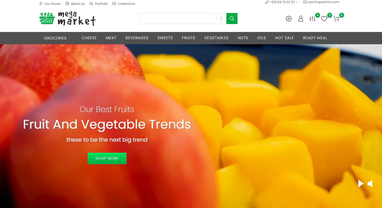
The video in the slider Mega Market Store - Food & Restaurant will help to increase the time spent by the visitor on the site. This is logical: a video can hook the reader even if he doesn't like the overall design and structure. And once you are hooked, there are more chances that he will still look at the assortment and rate your site.
Hover on the Product Element
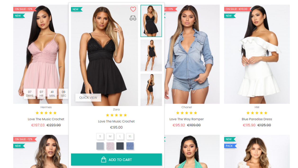
The product hover helps to make the website design more interesting and encourages the user to get additional information about the product.
In this design option for hovering over a product with gallery and attributes, and buttons such as Add to Cart, Wishlist, Compare, Quick View.
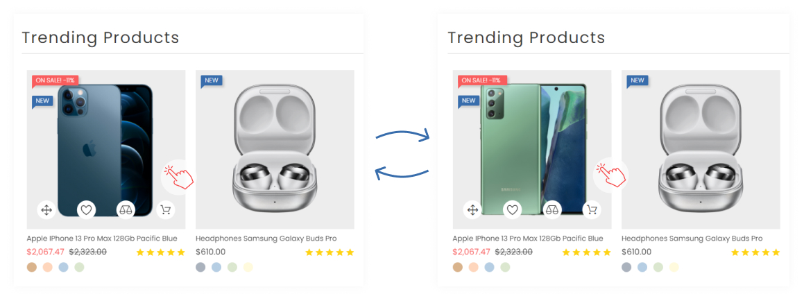
In New Device – Electronics & Computers Prestashop Theme pay attention to the second option, when you hover on a product, the Add to Cart, Wishlist, Compare, Quick View buttons appear, which are placed in stylish white circles. Rollover image with animation effects displays the second image of a product when a mouse hover.
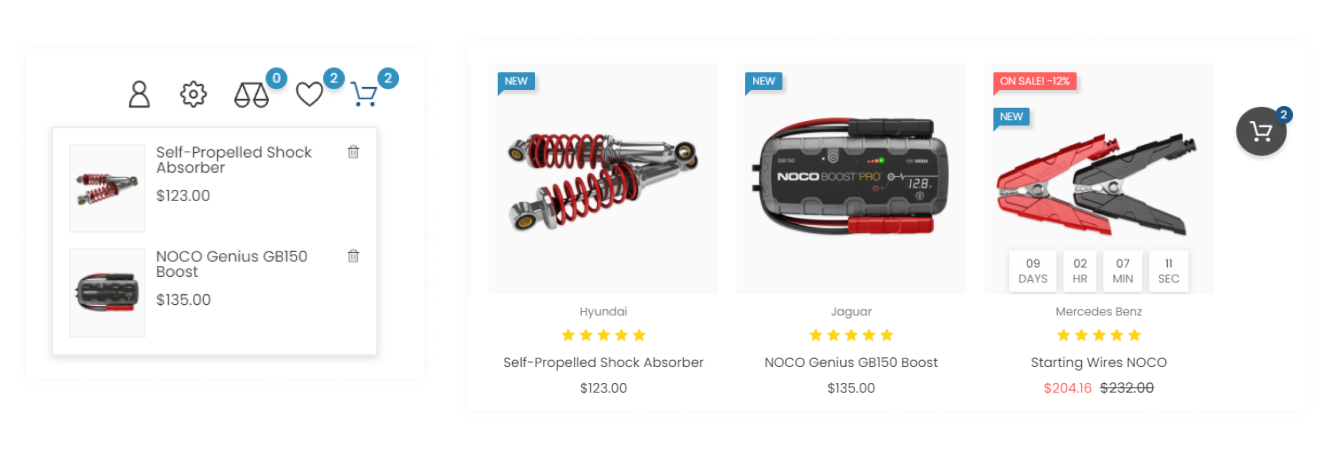
Sticky cart
Quite often, web design uses a fixed cart that helps the user see how many items have been added to the cart. When you click on a fixed cart, you can easily go to the checkout page.
Instagram Feed
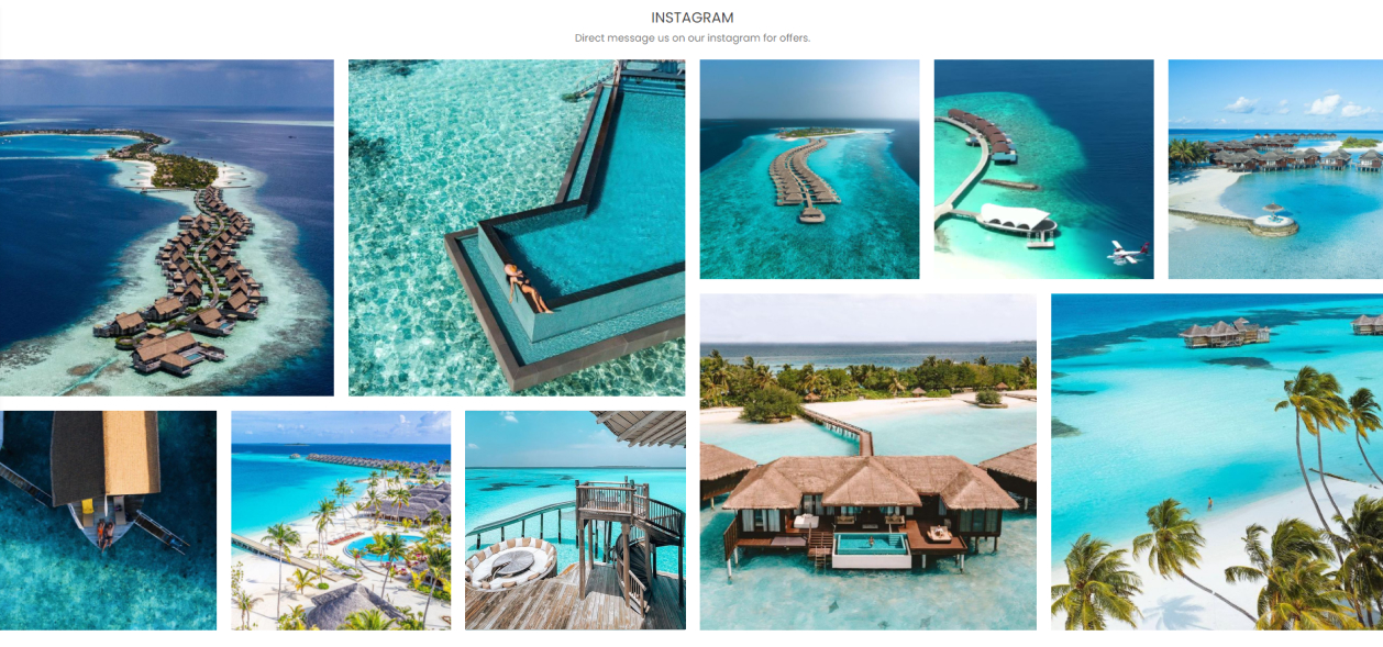
Adding Instagram to the site improves the overall look of the site design, helps to attract the attention of customers. The instagram gallery is very often used in modern design.

An Instagram feed with modern layout will help attract more buyers to social networks!
